

Mystics Spirits
Branding & Product Design, 2021
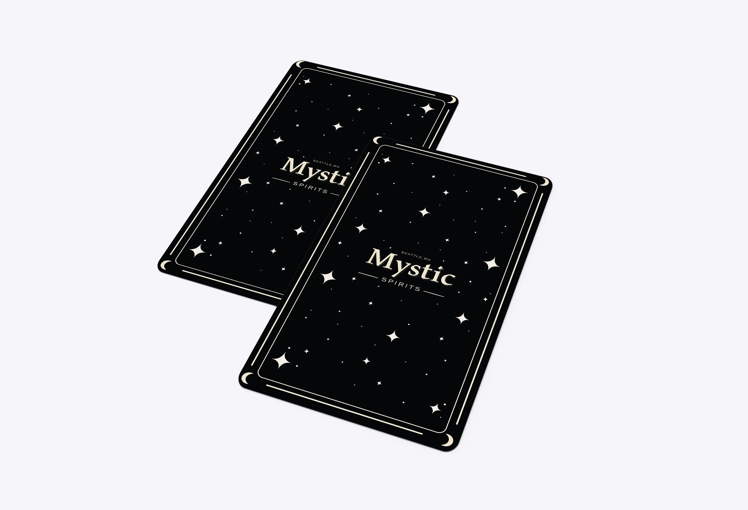
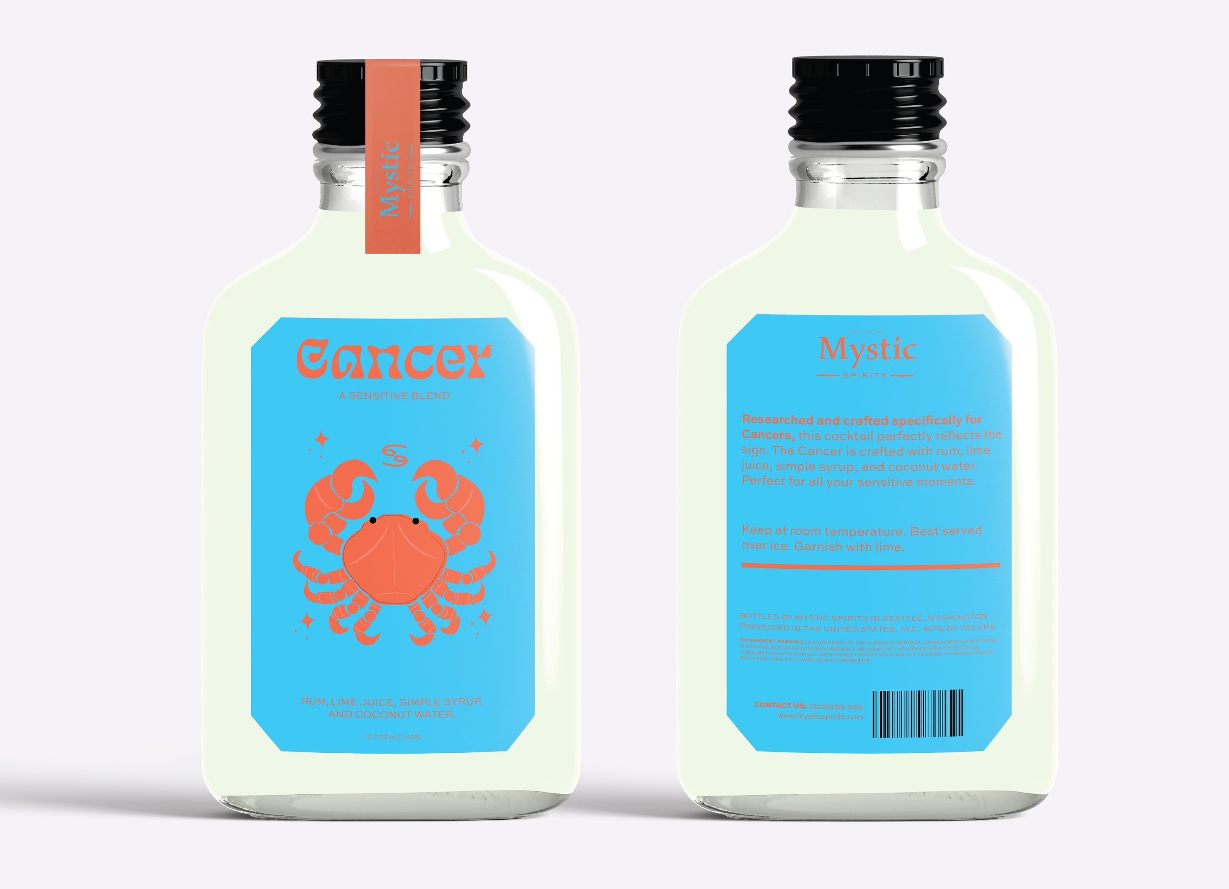
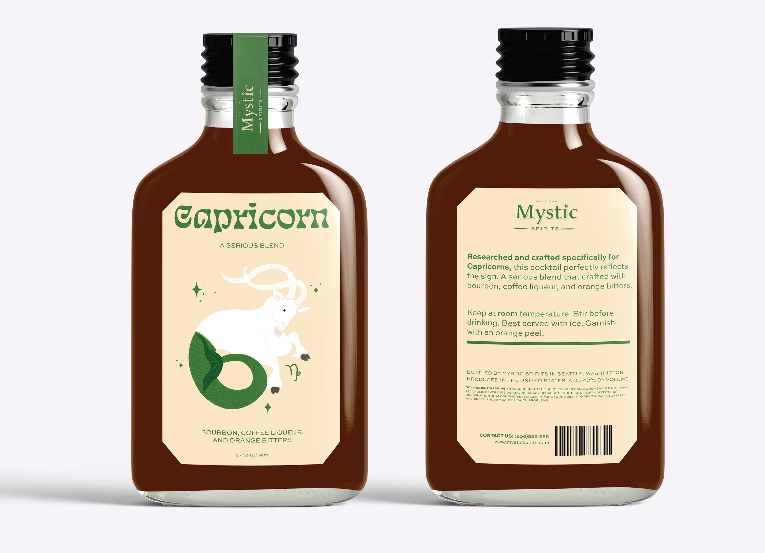
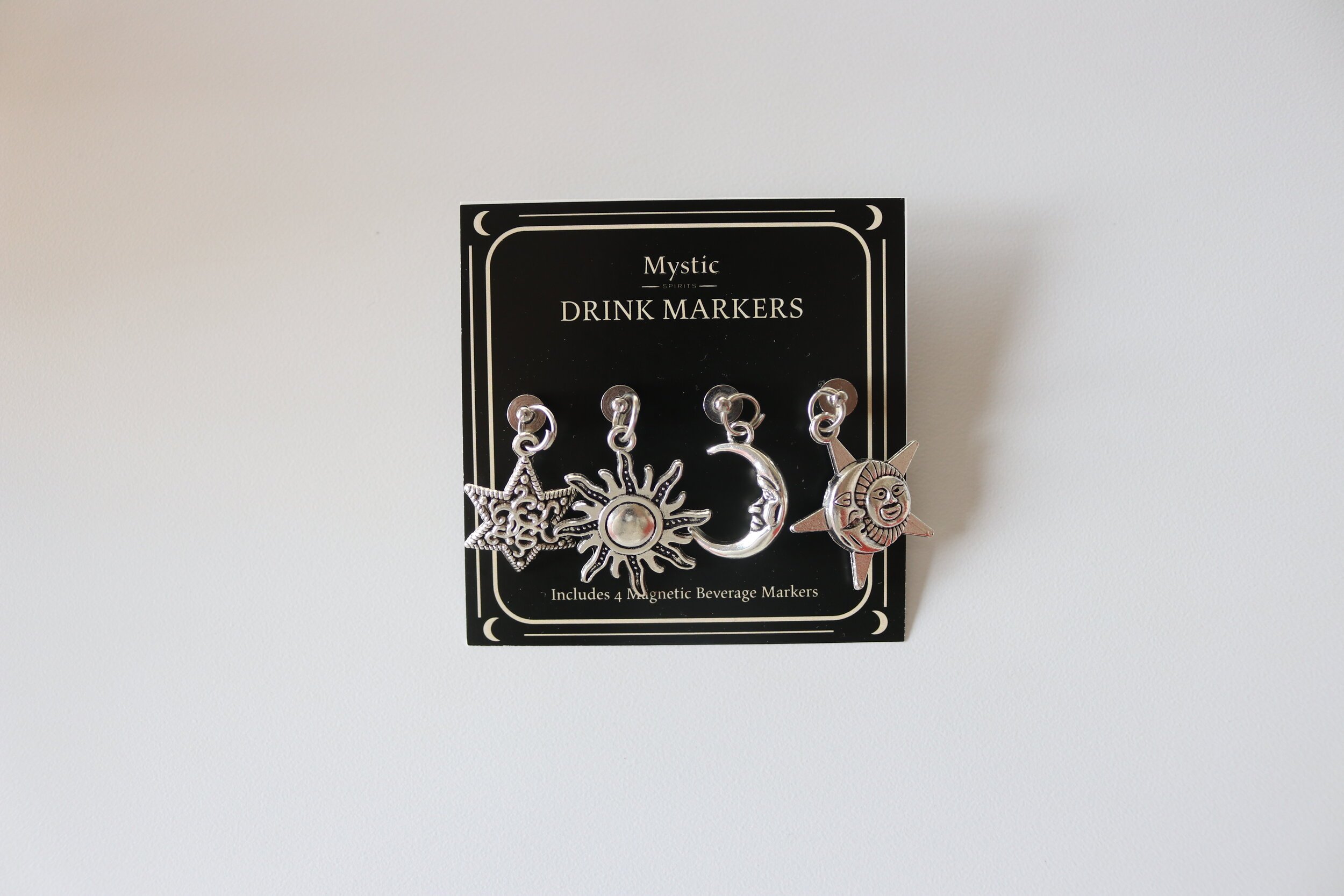
Mystic Spirits is an imaginary alcohol company I created that is unlike anything else on the market. The Zodiac Cocktail Collection is a selection of high-quality, handcrafted cocktails designed and made specifically for every sign of the zodiac. The drinks and labels are crafted based on market research data that I collected that reflects both the taste and color preferences of each sign. The original artwork I designed depicts the astrological symbol of each individual sign for easy recognition and creates a personal connection to the brand. Every bottle comes with four handmade, magnetic, reusable, celestial beverage markers and a collectable cocktail card. Mystic Spirits is a brand that values creativity, individuality, and quality.
Scroll for my design process & style guide ↓


Style Guide
-
Logo
A logo that could stand the test of time was important to me. However, it was also important that the brand still had a unique quality to it. The font “Maiola” used for the word “Mystic” is a distinct serif with qualities that embody the mystical aesthetic. The title of the “i” has this unique shape that almost mimics night stars.
-

Brand Color Palette
For the branding color palette, I chose black and cream. Overall, this matched the celestial vibe of the brand especially when paired with the symbols. I also thought it was important for the company branding to stand on its own when paired with the cocktail bottles.
-

Brand Typography
I wanted the fonts I chose for the brand typography not only to work beautifully in the logo but also when paired with the set. The brand and bottle branding should feel like an extension of one another.
-

Brand Symbols
The symbols used in the Mystic Spirits branding are simple celestial inspired symbols. They add character to the cocktail cards, tags, and marketing materials.
-

The Collection Color Palette
The label color choices were ultimately chosen based on my market research survey data. The shades and hues of each color were my mine. I wanted the color pair to compliment not only each other but the other signs in the set. I went with brighter colors to stand out against the black and cream branding.
-

The Collection Typography
For the collection type, I knew each bottle needed a fun, playful, stylized font choice. Eckmannpsych was the perfect choice for this project because vintage psychedelic style matches the overall essence of Astrology. Due to the stylized nature of the heading font, I wanted to pair it with a dependable sans serif which is why I chose Sweet Sans Pro.