

Pottery Barn Registry
As the lead designer for Pottery Barn’s Registry program, I oversaw the creative redesign across both email and paid channels. The objective was to create a cohesive and elevated experience that strengthened brand consistency, drove sign-ups, and increased engagement. From developing a refined color system and brand styling to designing paid ads that aligned with the new registry look, I helped unify the visual language across all customer touchpoints.
Creating a Distinct Registry Visual Identity
A dedicated registry lockup, refined palette, and subtle framing give registry its own visual identity while maintaining a clear connection to the broader Pottery Barn brand. Together, these elements create a consistent foundation across email, site, and paid social, allowing imagery and messaging to shift with each campaign while keeping registry recognizable. The result is a cohesive, elevated expression that makes registry feel like a considered destination within the brand.



The Registry Email Journey
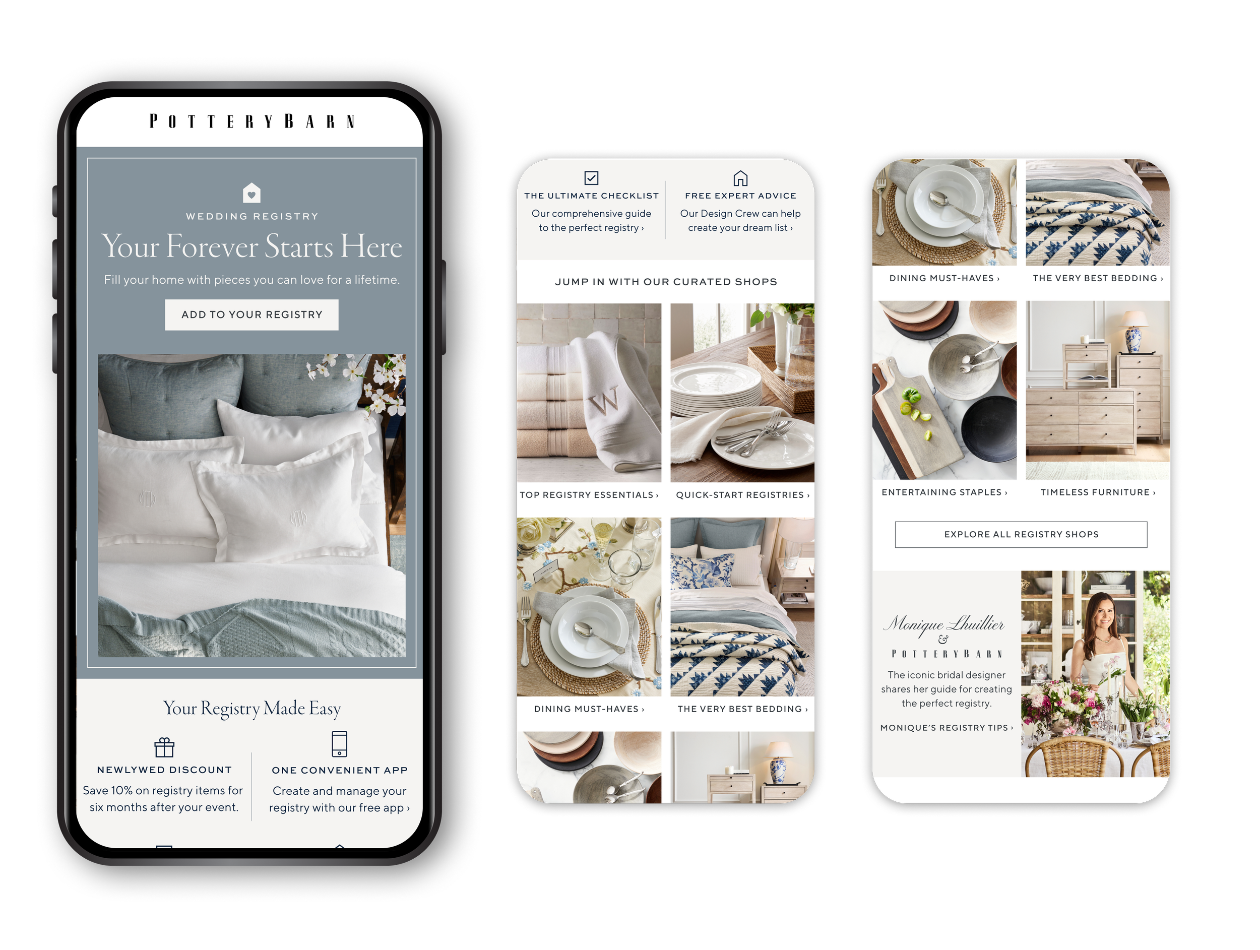
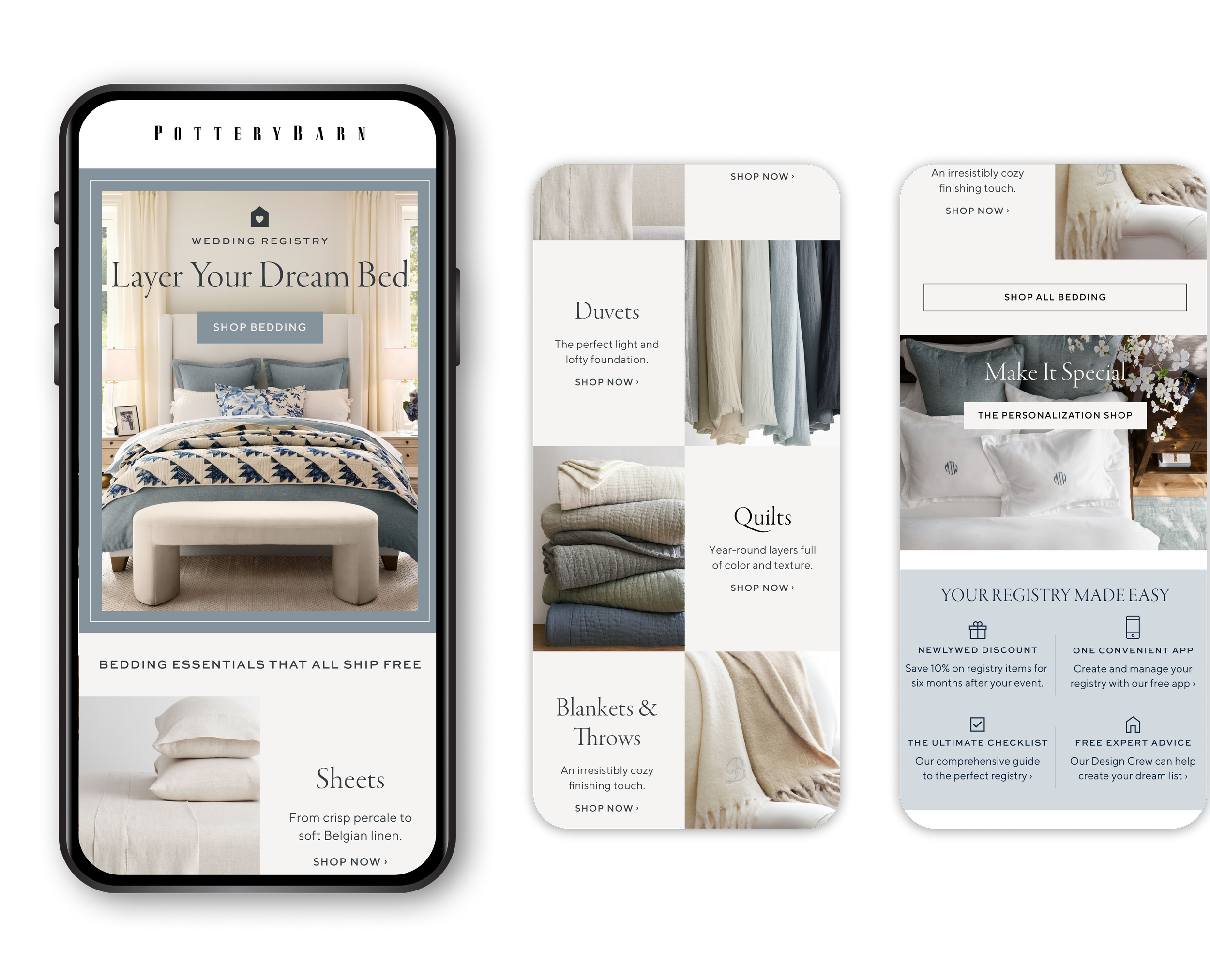
Selected example emails from the redesigned registry lifecycle, supporting couples from sign-up through life after the wedding.
G E T T I N G  S T A R T E D
Confirmation → Welcome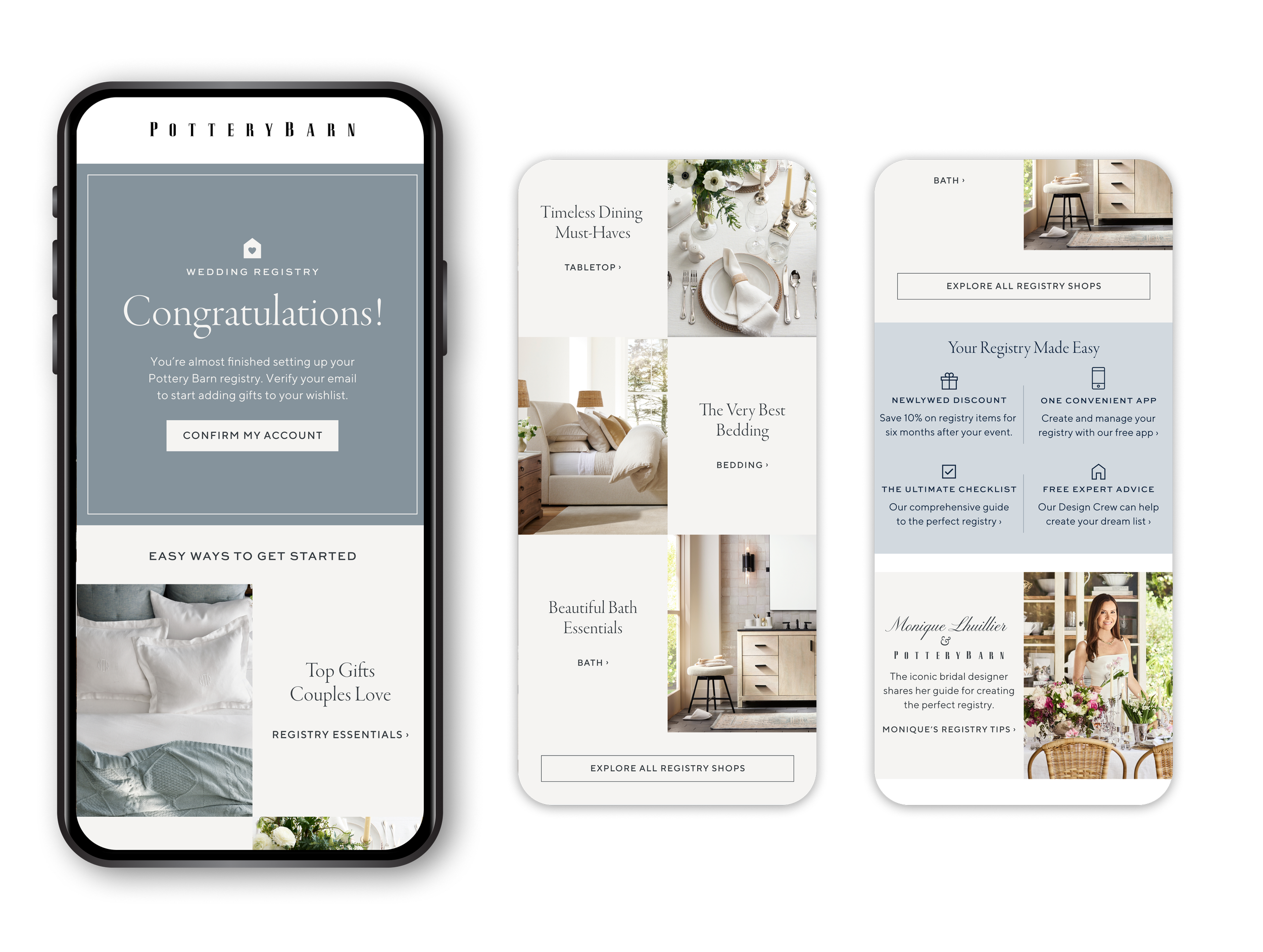
B U I L D I N G  T H E  R E G I S T R Y
Top Items → Bedding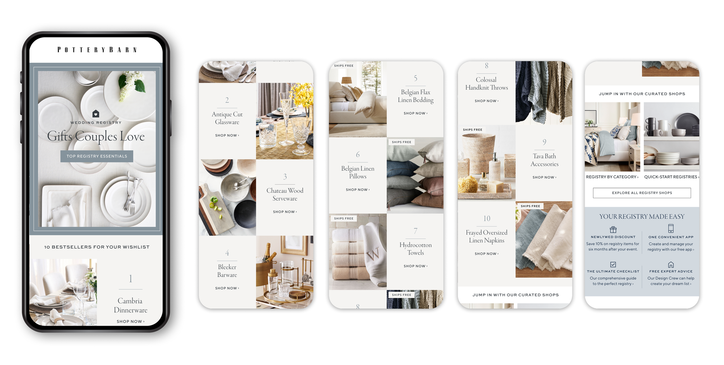
A F T E R  T H E  W E D D I N G
Congratulations → Completion → Last Chance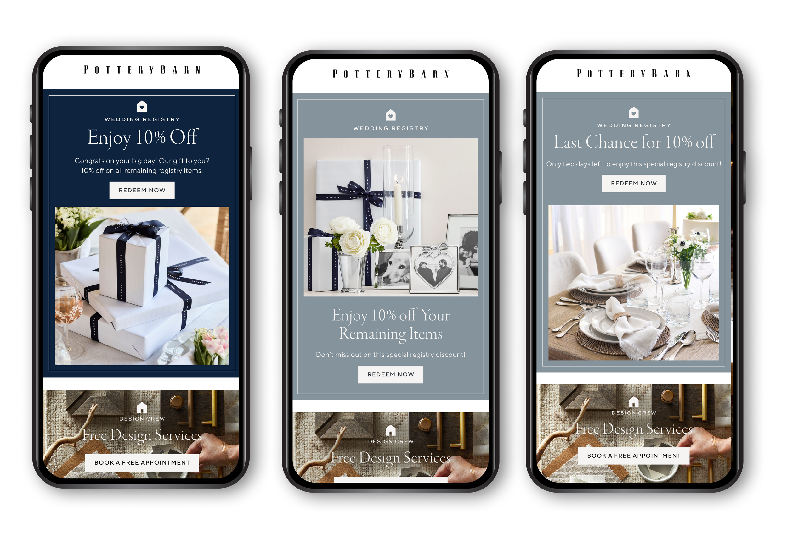
Paid Social Registry Ads
The refreshed registry identity extended into paid social, pairing product storytelling with clear messaging to encourage sign-ups.