The Fall Collection
2026
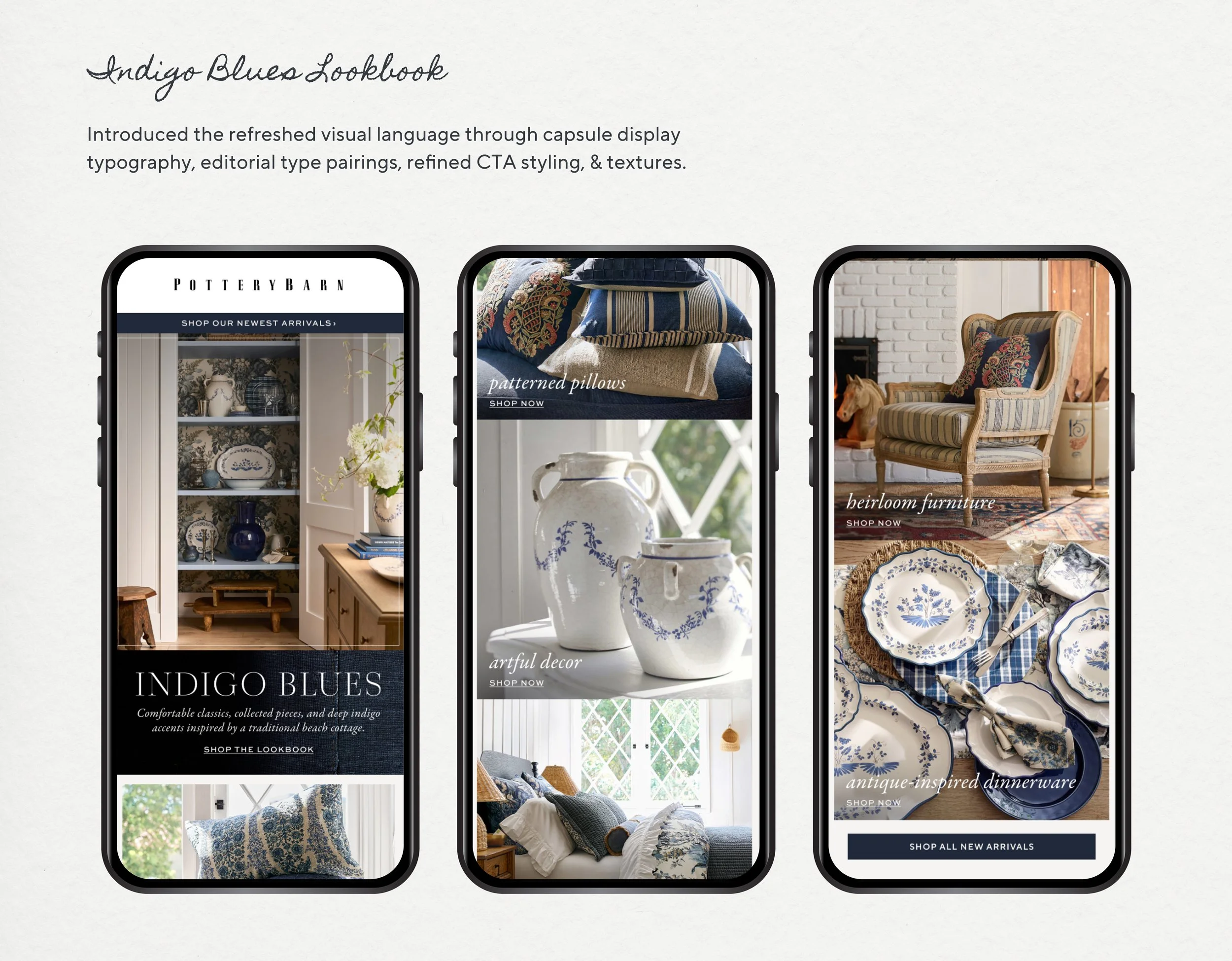
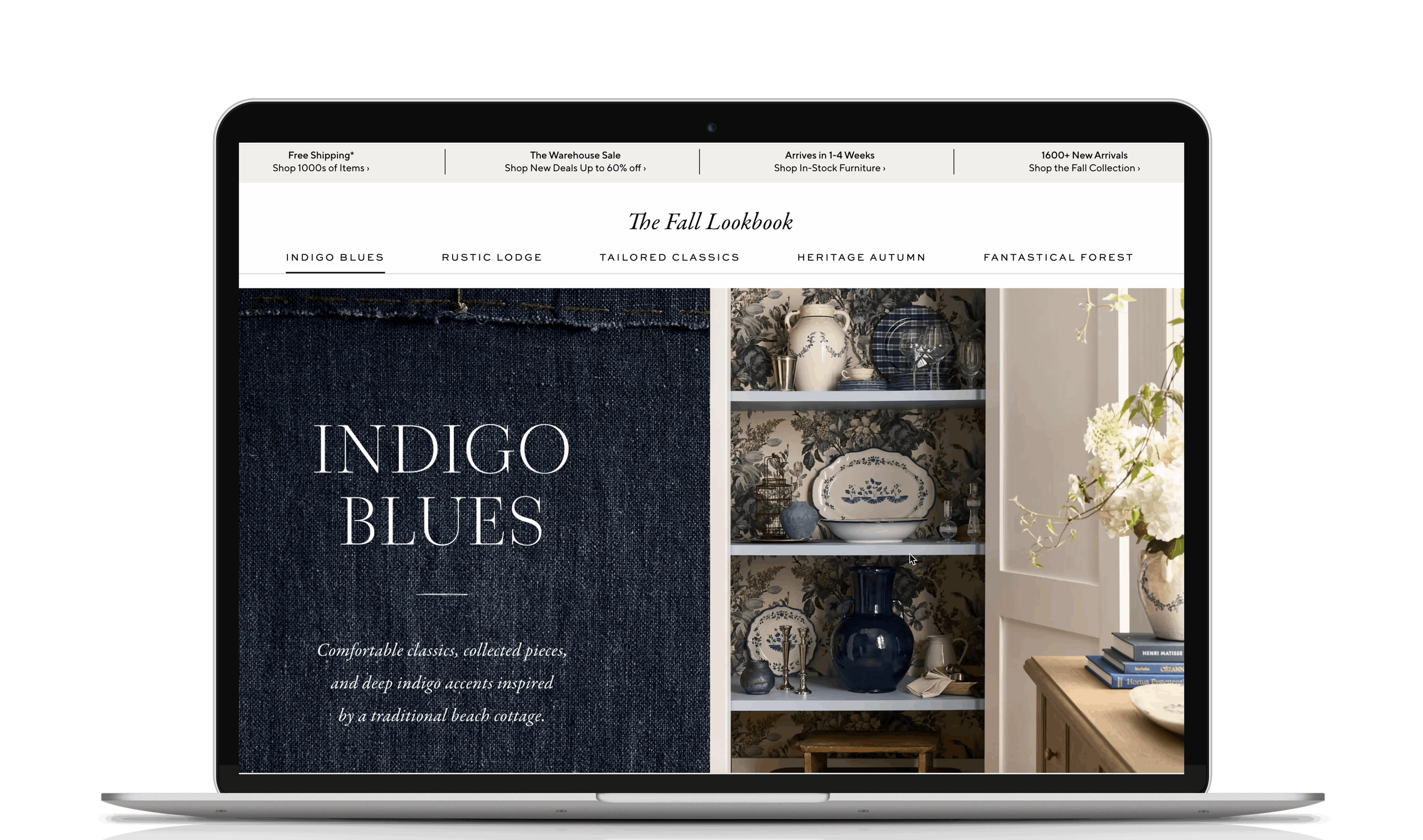
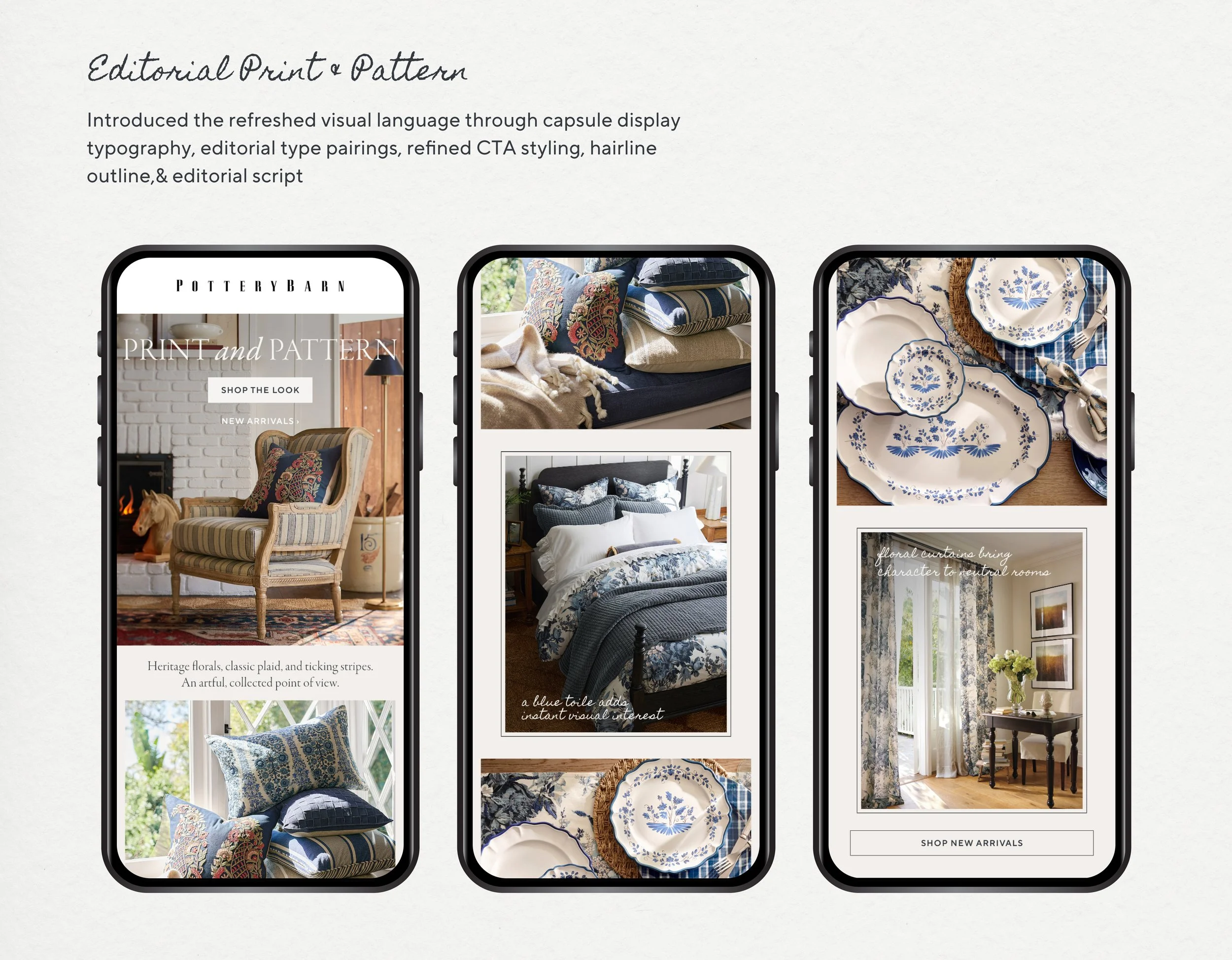
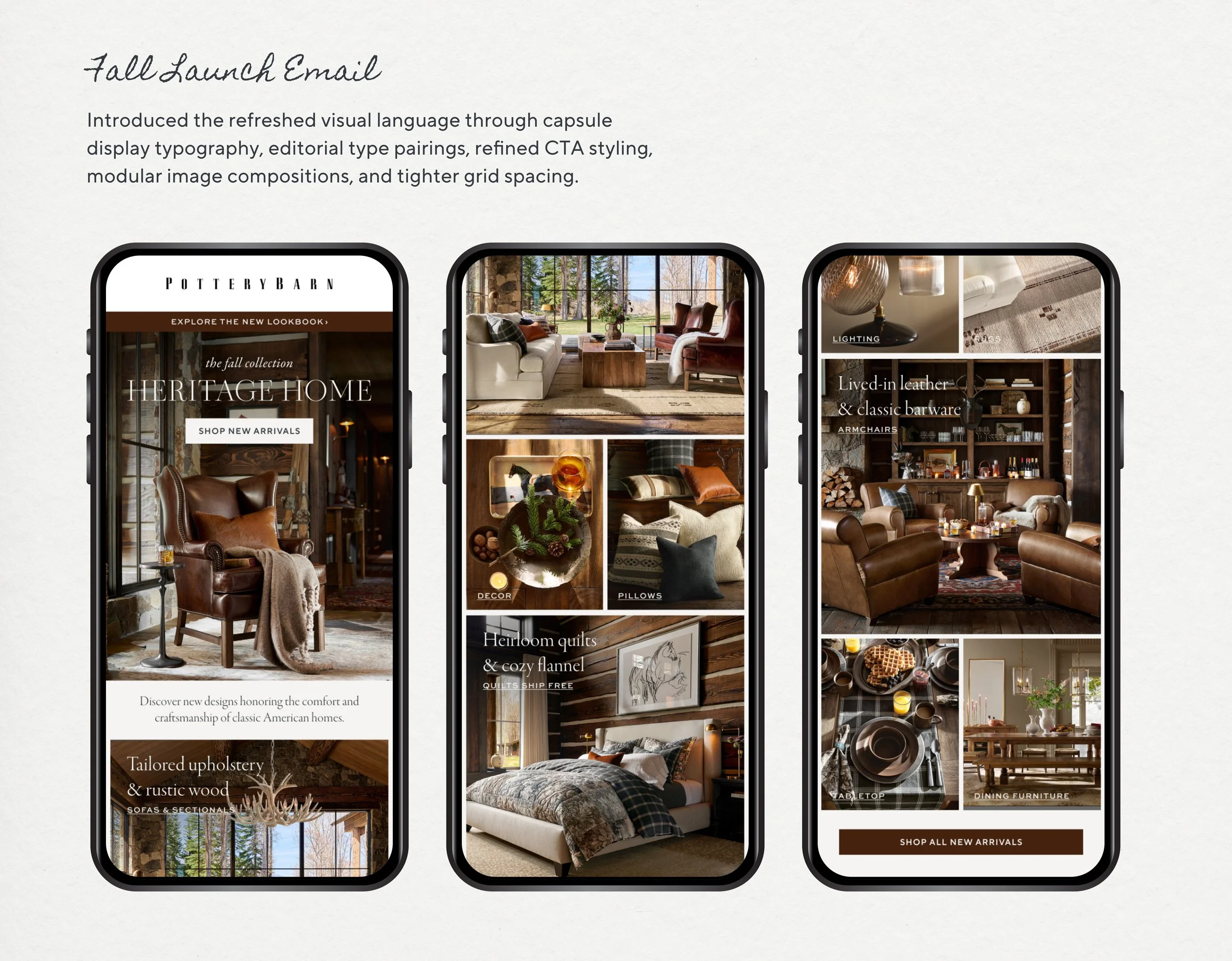
For Pottery Barn's Fall launch, I evolved the Performance Marketing design system, translating a new brand direction into scalable digital experiences. Working alongside the site designer, I developed a refined graphic language—including updated typography, editorial treatments, handwritten accents, texture, and reusable components—that unified email, CRM, homepage modules, paid media, and display.
Heritage Home
P R O J E C T O V E R V I E W
The Creative Objective
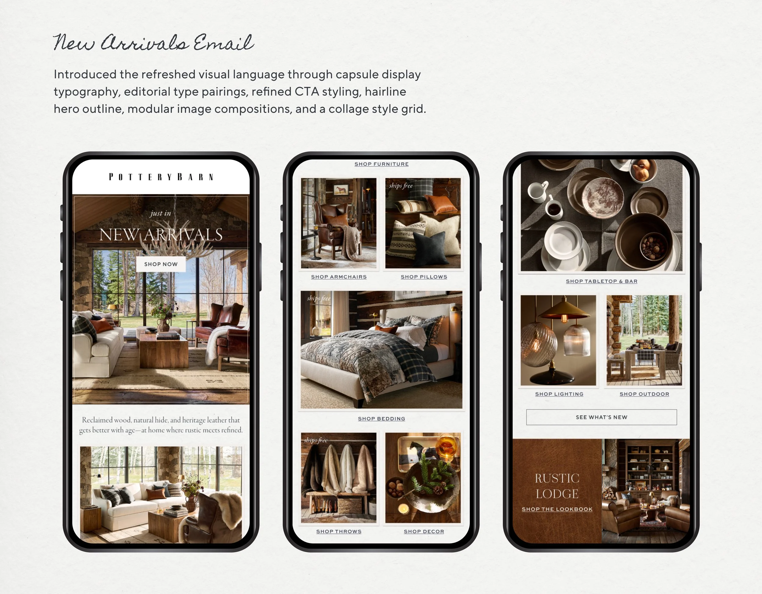
Introduce a refreshed creative direction that evolved Pottery Barn's digital brand expression through updated photography, styling, voice, and a refined graphic design system. The refresh included a new typography hierarchy, capsule display type, handwritten script accents, subtle texture, and refined hairline details designed to scale consistently across Performance Marketing.
The Challenge
Evolve Pottery Barn's digital visual language without disrupting an active marketing ecosystem. Existing automated assets from the MINK library continued running throughout the rollout, requiring the new design system to work alongside legacy templates during the transition. The solution needed to be flexible, scalable, and easy to implement incrementally—ensuring a cohesive customer experience while new creative was introduced across email, CRM, paid media, homepage modules, and display.
The Launch Experience
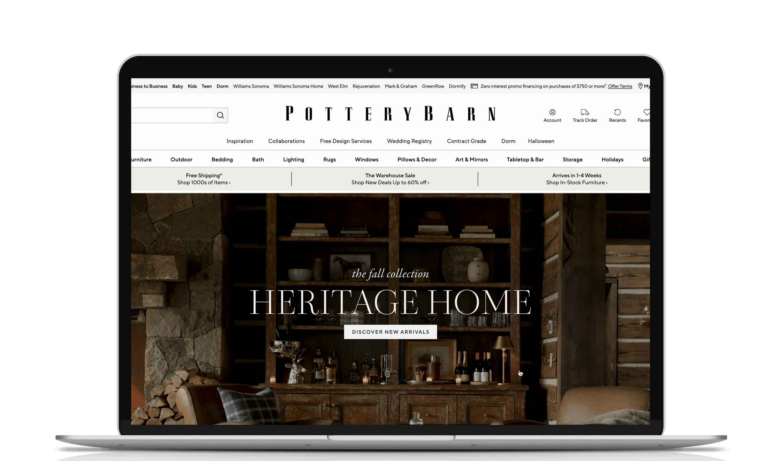
The refreshed design system made its debut through Pottery Barn's homepage and launch email, establishing the visual language that would scale across the broader digital marketing ecosystem.
Editorial Campaigns
Following the Fall launch, the refreshed design system extended into a series of editorial campaigns that mirrored the website experience. Each lookbook landing page was paired with supporting emails, creating a cohesive visual narrative across site and inbox while maintaining a consistent seasonal story.